Showing posts with label Modeling. Show all posts

Sunday, September 9, 2018

"Something old, something new..."

... Something borrowed, something blue. As the saying goes, I think I have that covered with this kitbash of one of the more iconic plastic structure kits of days gone by. Marketed under the Revel and AHM labels during my impressionable years, the Superior Bakery/Weekly Herald/Operating Engine House has always featured some of the best brick detailing ever to grace a model layout.

I have stashed away several new, untouched kits, as well as some previously kitbashed versions from my teenage years. For the most part, I abhor producing structures per the kit instructions, but I did want to take advantage of the quality of these kits. The prototype structures that I need to build don't necessarily mimic these details, so I decided that I could at least produce something that would serve as a nice background, non-rail-served industry.


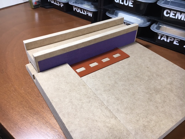
Nicely detailed aged brick is a hallmark of these kits. So sad that today's mass producers (I'm looking at you Walther's) roll out the masonry walls that they do. Note that two joints are visible here, but when  painted ultimately blend in very well.
 
Some clean-up work was required to salvage some old pieces. Regrettably then, but thankfully now, it seems that I was partial to Goo back in the day.
 
The new blue and yellow walls join the middle reclaimed section, plus a couple of end walls to form a background structure that measures just about 3" x 22". 
 
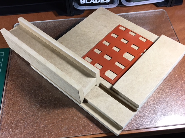
End walls were made from both a new kit and a previously used one. They were  joined with the central portion of the original gable ends so they could be cut to form a parapet. The building footprint was cut from a sheet of .060 styrene and served to help erect the walls at 90 degrees and help pull the front wall assembly together.
 
Gator Board was used as a back wall and interior bracing for it's rigidity and stability. I'm not sure what adhesive is best to merge the styrene with the Gator Board, but I'm thinking Super Z RC-56, otherwise known as canopy glue. Thoughts anyone?... please!
 
Some .060 styrene was used to fabricate the roof and now a decision needs to be reached about its final topping. Since several of my other industrial structures have metal roofs (standing seam or corrugated) it would appear that it's between shingles or tar paper. Shingles could look great, but that's a lot of shingles! Again, thoughts anyone?

The walls dress up pretty nice with a coat of a very dull auto primer and await some weathering. The roof will probably end up with a long clerestory or billboard-type signage to enhance its verticality. Window frames will be decided down the road once the structure's location and ultimate purpose is decided upon.
 
So, what about the "something borrowed" part? Well this idea had rattled around in my head for a few years. I had always been intrigued with a little structure that I saw on Kip Grant's layout and a larger one on Tony Koester's. Turns out Kip had built a cut-down version of Walther's Leviathan Manufacturing, while Tony doubled it up. 

I liked the rhythm that the windows and brickwork created. And the modest depth is perfect for a shelf layout. So I improvised using parts of a model that I always loved to get something similar to one I admire now.  Kip and Tony's finished work is pictured below. My finished photos are still to come.
 
-30-
 
 BONUS:  JUST  ONE  MORE  THING  BEFORE  WE  GO ... 


Friday, August 3, 2018

"Too hip to be square?... Nope, that not be us!"

Has it really been a year? Well, it has been a rough one for our family, but nevertheless, I simply cannot let the Old Main Line reach "one year ago" on the blog list. So without further ado, allow me to actually post something that has been sitting offline in my drafts folder for quite sometime.

The Garden State Division of the NMRA has conducted several meets featuring "works in progress" or WIPs that have been very popular for both clinicians and attendees. The low key, informal setting is relaxing for the clinician and extremely engaging for the attendee. A real win-win as they say.
 
Craig Bisgeier did a nice clinic on tools and techniques for kitbashing and scratchbuilding. But what really captured everyone's attention was the sanding square that he built to guarantee clean,  square  edges for cut materials.

The sanding jig is about 15" square and is predominantly made of 1/2" MDF. It relies on a glued block as a stop, or fence, set at a 90 degree angle to a sliding sander.

The H-shaped sliding sander sits inside a double track that is routed out of the MDF to guarantee an even, consistent sanding to the 90 degree fence.

Like an excited schoolboy at 3 pm, I dashed right home and built my own with a few modest variations in overall size and features using the same 1/2" MDF material. It's 12" square so I could maximize the use of a 24" x 48" piece of MDF.

Rather than routing out the MDF, I simply used two layers overall to create the tracks. All of the MDF pieces were glued and screwed together for a really strong and rigid bond. Plus I preferred the extra heft that the additional layering gave me for added stability.

I used double sided tape to hold the sandpaper to the slider and actually used two different grades on the two sides for added flexibility.

While squaring up corners is crucial in modeling structures, my main use will be in butting together multiple side pieces since I am replicating three major mill structures that require multiple kits to be kitbashed.

Since this was a relatively easy task, and since I had an excess of clear pine from assorted benchwork adventures, I decided to mass produce a dozen 8" x 8" sanding jigs. I used the leftover 1/2" MDF as a base and 3/4" clear pine for the sander and fence. In a moment of sheer madness, I gifted them to my fellow GSD board members as a gesture of kindness.

Even made a few for lefthanded modelers. We're a full service that aims to please!

The underside shows the screw placement to hold the double layer. The four corner self-adhesive bumpers are reinforced with a dab of Goo for better adhesion.

I believe that there are similar jigs available commercially, and knowing Craig, he probably just wanted to save a few bucks while sticking it to the man. But one must admit, it's a neat, little project. I'm considering a few options on how best to build a second sanding slider that will give me a 45 degree angle for corners.

But that's it for now. Back to life's challenges. My hope is to have some energy to more regularly update this blog, because although postings have seriously lagged, work on the layout has only modestly been affected. Later!

-30-
 
  BONUS:  JUST  ONE  MORE  THING  BEFORE  WE  GO ... 


We may live just 25 miles from the media capital of the world, but the editors of a local monthly may want to work on tweaking some of their headlines. Duh!... ya think?


Saturday, March 26, 2016

"Damn it, get up!... You can sleep on the beach!"

The ladies of the household dragged me to Mexico's Riviera Maya last week so I could reprise my role in, "You're so annoying." Far be it for me to say, but I don't understand the logic of waking at dawn to secure a prime beach chair under a hut out of the sun, then slathering on sun block from head to toe for protection from said sun, before dozing off for much of the day. I could achieve the same result staying in my air conditioned room, with a lot less fuss and a lot more ESPN. 


Whatever the case, I reluctantly experienced the beach ambience with my wife and daughter while a favorite RPM commenced in Malvern, PA. No clinics, no models, no layouts, no nothing. Just a bunch of topless European women on holiday with, and I'm guessing here, no interest whatsoever in model railroading. But I did get a hobby fix via an email thread that I will unabashedly share here. 

Jim Dufour enlisted the help of the visiting Randy Laframboise to complete some river scenes on his B&M Cheshire Branch. Due to the river's slope, they  chose Golden Polymer Medium to pour into the previously  modeled river beds, per Glenn Glasstetter's advice.


Tony Koester commented that New England's cleaner waterways present more of a modeling challenge than the Midwest or central Appalachian regions which merely require that modelers fill the undetailed basins with plaster and paint them  pea-soup green, before building up layers of gloss medium.


While the acrylic gel was easy to work with for Jim and Randy, Bernie Kempinski reminded all of the anxiety of dealing with the alternative two-part resin option. He suggests that the most reliable and most foolproof is Magic Water from Unreal Details.
 
Jim referred to Randy as "ever fearless." in his email. Kip Grant beat everyone else to the quip, "It's easy to be fearless when it's someone else's layout!"  Truth is, we all recognize Randy's talent and his willingness to help, not to mention his ability to throw good-natured verbal jabs of his own when he spots an opening. For today, we'll just say that Dairy Boy done good here, real good.

Well, this is post numero 75 for this blog and it seems like a good number to finish up with as the one year anniversary is a week away. I'll be back on that special day with one more entry. Thanks everyone. We'll see you then.

-30-
 
   BONUS:  JUST  ONE  MORE  THING  BEFORE  WE  GO...  
 
My daughter, Senorita Wise-Ass, suggested that I post this photo from the local OTC farmacia as a public service to all modelers.


Thursday, March 10, 2016

"Modeling using selective orientation..."

Back in August, I wrote about a design and modeling concept that I referred to as selective representation. I concluded that it is just one aspect of the overall collective idea of selective compression. Now, I'd like to suggest combining that component with what I term, selective orientation. It's about the idea of necessary compromises to re-orient a structure relative to its relationship with the track, or the track's relationship with the benchwork footprint as mandated by room constraints. Everyone still on board so far?

As I play with track arrangements on my completed sub-roadbed, and continually fine-tune my drawings, I realize just how much of a challenge that selective orientation will be on my shelf layout. The photos below tell the story best.

The flour mill at Ellicott City bears off the main at a fairly sharp angle and crosses the river. The building itself is u-shaped and surrounds two spurs making operations difficult for my 1:1 crew. The angle can be reduced, but the building components may need to be staggered to allow decent access for visiting operators switching cars.
 
At Ellicott City, the track and Patapsco River travel east-west while the distinctive main thoroughfare climbs a hill in a north-south direction. Rotating that perpendicular relationship into more of a parallel one is the only way to depict any portion of the town, even when taking advantage of the depth that an inside corner of the benchwork offers.

One half mile up the river, around a horseshoe bend that would be best suited at the end of my peninsula is the Dickey textile mill in Oella. Alas, too many other layout design factors mandated that Oella end up along a straight portion of the benchwork, but that is the least of my worries. The structure is t-shaped and accepts a spur almost perpendicular to the mainline and river. This would work nicely if my shelf was about 42" deep!

The Dickey mill will need to be selectively represented predicated on its dominant window and brick fenestration, but re-oriented 90 degrees to fit the 20" deep benchwork. The sharp angle will be reduced so the spur can run alongside the front of the structure rather than the side. So exactly when is it that we enter no-longer-prototypical territory?


The Daniels mill complex is distinctive by the horseshoe curve of the river and the massive original building set perpendicular to the mainline. Like at Ellicott City and Oella, Daniels' spurs are severe and surrounded by structure causing headaches for humans bearing uncoupling skewers. And no one wants to be around a frustrated human wielding a skewer.

This axonometric drawing from the early 1900's shows the two original spurs, including a coal trestle, that bear off at about 45 degrees from the main. A third spur was present in 1960 and cut straight across the front of the original building into a 'well' created by the expanded complex. It is evident in the photo above.


Like so many aspects of building a prototype-based layout, compromises become the devil in the details. We continually try to determine the least of the necessary evils. How can we best determine what must be done, and what might be done without compromising things too much? Go too far, for whatever reason, and the layout becomes nothing more than the equivalent of a cheap made-for-television murder mystery, "based on actual events."

I guess we'll see as we move forward. My very first track plan shows my earliest attempt at dealing with each of these LDEs. Some modifications are forthcoming. But for now, work and life in general will waylay me for awhile. See you a bit later, but please comment with your own layout design experiences.
 
-30-
 
     BONUS:  JUST  ONE  MORE  THING  BEFORE  WE  GO... 
 
Check out the 2016 issue of Model Railroad Planning for a feature on the Rutland Railroad layout by Randy Laframboise and Mike Sparks that was a very popular post here last summer. Congratulations, boys!

Friday, January 22, 2016

"From the land of pleasant living... Part deux"

While we await the approaching blizzard that our local media has been excitedly forecasting for the past week, I am mixed with childish anticipation for a good snow storm and the more mature nervous anxiety from memories of several power outages during the past few years. Either way, it may be wise to get a new post published while it's still relatively calm here.

This will be short and sweet. My previous post on period ads and brand logos generated considerable emails, so here's a few more.

One can never have enough 'Natty Bo.' A circular sign plastered to the side of a structure always looks neat, and unlike a Coke sign for instance, this brand has local chops.
I'm not too concerned if any image is fuzzy or faded. When reduced and weathered, I suspect they'll be just fine. I like this one due to the inclusion of Baltimore, Maryland.

While I dissed Gunther Beer in my previous post, I actually uncovered quite a bit of their images and will find a way to afford them some equal time on the layout.

Again, I'm not too worried about the fuzziness, but love the Baltimore, MD.

Another circular sign for a general store. But this 'Frostie' may be poorly timed right now.

Somehow I'm not sure come tomorrow whether I'm thinking that 'Frostie' is a good thing. 

That's it for now. Hopefully mother nature will provide only a modest distraction that will yield some hobby time, but we'll see. The basement actually had a minor change in infrastructure this week that will accommodate a new staging arrangement. Photos shortly, followed by some track drawings. Stay warm.

-30-
 
   BONUS:  JUST  ONE  MORE  THING  BEFORE  WE  GO...  
 
The battle of the Baltimore beer trucks! I may have to go with this one over last week's National Bohemian truck. Opinions anyone?


Saturday, January 16, 2016

"From the land of pleasant living..."

I'm rather envious of how productive some of my fellow bloggers have been recently. For me, traditional holiday activity, combined with ongoing family needs, has pretty much negated any opportunity to really dig into meaningful work in the basement.

But I did steal some time recently on the computer to do some additional research on Baltimore and surrounding areas in 1960. I was most interested in confirming popular local brands from that time for use as layout signage and for ambience in the lounge area. Significant identifiers such as beers, soft drinks, restaurants, TV/radio and professional teams seemed like good places to start.


'Natty Bo' is the local beer of choice, then and now. The iconic mustachioed character immediately identifies the brand. I think that this could make a great billboard.
Another version of the beer's advertising features a different tag line, but one I think is so evocative of an earlier, simpler time. Alas, I must identify which slogan was used in 1960. I am really hoping that it is this wonderfully innocent one, "from the land of pleasant living."
If National Bohemian, sponsors of the football Colts, could be, "Oh boy, what a beer!" then competitor Gunther might as well be, "G, what a wonderful beer!" They sponsored the baseball Orioles, but do not seem to have been much of a factor in the beer market.

Frostie root beer was a very popular regional drink in 1960. I suspect that a little bit of Photoshop work could make this a really neat metal sign adhered to the side of a general store or feed distributor for instance.
The only one real radio station in Baltimore back in the day was WBAL-AM who broadcast the Colts,  Orioles and all of the day's popular hit songs. 
I have countless images for the Baltimore Colts who entered 1960 as the defending NFL Champions. This earlier logo, predating the iconic horseshoe, is thoroughly unsophisticated and too busy to be marketable today. It is not slick whatsoever, therefore perfect for its time. 
Like the Colts, I have countless images for the Orioles, but am unsure I actually have anything to use, outside of pennants or banners that could find their way into a scene on the layout. But research did confirm a local pastry from that time and I'll follow-up on Tastykake to see what I may find.

Several Colts' players capitalized on their fame with local business ventures in the late 1950s/early 1960s. Fullback Alan Ameche of overtime touchdown fame had a number of drive-in family restaurants, while his teammate, defensive end Gino Marchetti, had Gino's, a fast food burger place. Each took advantage of the early days of the McDonaldization of America.

 I enjoy research because you never know what you may uncover. One other interesting tidbit comes from the Carling Brewery, which handled Natty Bo for awhile. They introduced a malt liquor product around this time, long before political correctness was even a concept. Although it was called Colt 45 and used a pistol as its logo, it allegedly was named after Colts running back Jerry Hill who wore number 45. I can't verify that, or simply attribute that to folklore. Either way, it's part of the fun of research.

Having said that,  I am really chomping at the bit, as they say, to get back to building and modeling. One can hope. Cheers.

-30-
 
   BONUS:  JUST  ONE  MORE  THING  BEFORE  WE  GO...  
 
This photo from the Baltimore Sun archives shows a National Bohemian delivery truck... definitely something that looks like it can be fabricated from one of my many Mini-Metals HO scale vehicles.


Saturday, January 9, 2016

"Once it was Crayolas... Now, it's all PanPastels."

I guess one of the beauties of having an adult hobby is the opportunity for loved ones to supplement the obligatory holiday gifts of socks, ties and underwear with something that still makes us feel like a kid on Christmas morning. But as I comprised a wish list for my wife and daughter, several ironies did dawn on me.

PanPastels topped my list so that I could begin to weather the roster I have been compiling, but it made me question just how far I had really come in 50+ years. Back then, Crayola Crayons were the ticket for all things coloring... book reports, posters, banners, etc. Had I simply exchanged one iconic product for a future one? No matter, at least now I knew that it was actually advisable to wander outside of the lines... and that Raw Umber and Burnt Sienna now had a rather important place in the color palate very near the head of a mature class.

Santa delivered the two primary sets of muted colors... the very same colors that were often left with hardly-worn near-perfect points in the old Crayola box. The wide choice of sponges should assure that I will deliberate far too long over which is best for any given application.

Tony Koester presented an article in the November 2013 Model Railroader on quick and competent weathering for large rosters specifically using this product. The author, editor and lifetime veteran of our hobby essentially advised that anyone could do this... which is probably easy for an author, editor and lifetime veteran of the hobby to say! But as far as I know, no one has ever confused with me Tony. Hmmm, should I remain skeptical?
But 'rock star' and former blogger Ralph Heiss of the Lehigh Valley Harbor Terminal Railway presented a clinic on this very topic to the Garden State Division almost two years ago. The theme? "If I can do it, then anyone can." OK Ralphie boy. Then I'm in.

I look forward to experimenting on some really old, toy-like Tyco boxcars and the like. But I would love to hear from any other blogger who may have posted about this, or any reader who may be able to provide a link or interesting tidbits about their own experience using PanPastels. Please add your own two cents in the comments section below. Thanks and happy coloring!

UPDATE: January 16, 2016 
Click for WEATHERING TUTORIAL from Ralph Renzetti of Railroad Lines Forum.
Click for WEATHERING POST and other links from Chris Ellis of the Adena Railroad blog.
-30-
 
   BONUS:  JUST  ONE  MORE  THING  BEFORE  WE  GO...  
 
As kids, we all knew that getting the Crayola 64 pack was like hitting the mother lode. Hallmark has cleverly marketed Christmas tree ornaments that tap into such nostalgia. My wife just had to have it!